CSS Container Queries Explained With a Real Layout
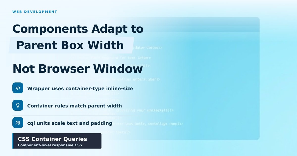
TL;DR: CSS container queries let a component change its layout based on how wide its parent box is, not the browser window. You mark a wrapper with
container-type: inline-size, then write@containerrules that only apply inside it. One card, same HTML, correct layout in the main feed, the sidebar and a pop-up.
Your product card looks great in the main feed. Then you drop the same card into a 280px sidebar and it falls apart: the title wraps five times, the image squashes, and the price slides under the button.
You've built one component and somehow need three versions of it. For years the fix was extra CSS classes or a media query that guessed. Container queries let the card decide for itself.
CSS container queries vs media queries
A media query asks "how wide is the browser window?" A container query asks "how wide is my box?"
That difference matters the moment your layout has parts. A sidebar, a modal, a two-column grid: they all change width while the window stays exactly the same size. Media queries can't see any of that, so your card keeps its wide layout inside a narrow column.
Say a card sits in a 320px slot on a 1400px screen. The window is huge, so the media query fires and the card goes horizontal. It overflows. Container queries look at the card's own space and pick the layout that fits.
How CSS container queries work in a real layout
Two steps. First, tell the browser which element to measure. Second, write rules against that measurement.
.card-slot {
  container-type: inline-size;
  container-name: card;
}

@container card (min-width: 400px) {
  .card {
    display: grid;
    grid-template-columns: 120px 1fr;
    gap: 16px;
  }
  .card__img {
    height: 100%;
    object-fit: cover;
  }
}
container-type: inline-size makes the browser track the width of that element. Everything inside it can then ask about that width. (Inline size means width on a normal left-to-right page; container queries can't measure height yet.)
The rule fires only when .card-slot is 400px or wider. Narrow sidebar? The card stacks. Wide feed? It goes side by side. No extra classes, no JavaScript, no duplicated HTML.
Naming the container is optional but smart. Without container-name, a rule matches the nearest container up the tree, which gets confusing once cards sit inside cards.
Container query units and browser support
Container queries come with their own units. cqw is 1% of the container's width, cqh is 1% of its height, and cqi is 1% of the inline size.
Those units let padding and text scale with the card instead of the screen. A headline set to font-size: clamp(1rem, 4cqi, 1.5rem) grows in the feed and shrinks in the sidebar. That's the trick that stops a layout looking cramped at 280px.
Browser support is settled. Chrome 105, Safari 16 and Firefox 110 shipped container queries between late 2022 and early 2023, and every current phone and desktop browser handles them. Still, write your base CSS so it looks fine before the @container rule kicks in.
What this means for your project
Container queries are the right tool for components: cards, buttons, nav bars, form rows. Media queries still win for page-level decisions, like collapsing the whole sidebar on a phone.
A few rules that save time:
- Put
container-type: inline-sizeon the wrapper, not the card itself. Children do the querying. - Treat your default CSS as the narrow state, then add
@containerrules for wider boxes. - Add
container-nameas soon as components nest. - Test at 280px, 400px and 700px container widths. That's where cards break.
Skip them when the layout depends on the actual screen, like a sticky header or a full-width hero image.
Key Takeaways
- Container queries size a component by its parent's width, not the window.
container-type: inline-sizeon the wrapper is the entire setup.- Media queries handle page layout; container queries handle what's inside it.
cqiandcqwunits let padding and text scale with the card.
Frequently Asked Questions
Are container queries supported in all browsers?
Yes, in current versions of Chrome, Edge, Safari and Firefox. Support landed between 2022 and 2023, and it works on mobile too.
What's the difference between a container query and a media query?
A media query checks the browser window. A container query checks the width of a parent element you've marked as a container, so the same component adapts inside a sidebar or a modal.
Can container queries replace media queries?
No. Use both. Media queries arrange the page, container queries arrange what goes inside each piece of it.
Do I need to name the container?
No, but it's worth doing. Named containers avoid surprises when one container sits inside another.
Sources
- MDN — CSS container queries: https://developer.mozilla.org/en-US/docs/Web/CSS/CSS_containment/Container_queries
- web.dev — Container queries land in stable browsers: https://web.dev/articles/cq-stable
- Can I use — CSS container queries: https://caniuse.com/css-container-queries
How did this story feel?
Be the first to react
AI assistance. This article was researched and drafted with AI tools and reviewed by our editorial team before publication. We link to sources at the end of every article so you can verify the claims. If you spot an error, please let us know.
Recommended gear
Popular tech picks

Samsung Galaxy S25 Ultra
6.9" AMOLED · 200MP · 5000mAh
Editor's pickView on Amazon →
Apple MacBook Air 13-inch (M4)
M4 · 16GB · 13.6" Liquid Retina
Editor's pickView on Amazon →
Sony WH-1000XM5
Over-ear ANC · 30h battery
Best headphonesView on Amazon →Affiliate links: we may earn a commission at no extra cost to you.
More on #css
Weekly tech brief
The tech stories worth your time, every Sunday.
One short email with the most useful guides and gadget picks from the week. No spam, unsubscribe anytime.
Written by
TechPulse TeamThe TechPulse editorial team publishes clear, practical technology guides. Every article is original and written to be understood — not just skimmed. Read our editorial policy.
Comments (0)
No comments yet — start the conversation!
Keep reading

Cookie Alternatives for Login That Actually Work
Cookies still work for most browser logins, but they aren't the only option. Here's a plain-English look at tokens, local storage and passkeys.
What a Content Security Policy Actually Blocks
A CSP is a guest list for your browser. Get the list wrong and your checkout breaks. Here's what it really blocks, and the mistakes to avoid.

Web Security Headers Every Site Should Set
Five server-side headers block most common web attacks, and four of them are safe to switch on today. Here's what each one does, in plain English.